My Review of Adobe Color CC
When it comes to using Adobe Color CC, I have to say that I’m pretty impressed. This tool offers a wide range of features that can help you with your creative projects. Whether you’re a professional designer or just someone who enjoys exploring different color combinations, Adobe Color CC has got you covered.
One of the things that I find particularly useful about Adobe Color CC is its simplicity. The user interface is clean and intuitive, making it easy for anyone to navigate and use. Whether you’re a beginner or an experienced designer, you’ll find it easy to create and save custom color palettes.
Speaking of color palettes, Adobe Color CC offers a variety of ways to create them. You can start from scratch and manually choose your colors, or you can use the website’s built-in color wheel to explore combinations. And if you’re feeling particularly adventurous, you can experiment with the extract feature, which allows you to extract colors from images.
But Adobe Color CC isn’t just about creating color palettes. It also offers tools to help you fine-tune your selections. You can adjust the brightness, saturation, and hue of each color, allowing you to create the perfect look for your project. And if you ever feel like you’ve hit a creative roadblock, you can rely on the explore feature to find inspiration from other color themes created by the community.
Overall, I can confidently say that Adobe Color CC is a powerful and versatile tool for all your color needs. It’s user-friendly, offers a variety of features, and provides ample opportunities for creativity. Whether you’re a professional designer or a casual enthusiast, this tool is definitely worth checking out. So why not give it a try and see where your color journey takes you?

As someone who manages small business websites, I’m naturally interested in design and color use. One tool I used to love using was Adobe Kuler. It was this cool app for iPhones and Androids that let you create color schemes and share them with the Adobe community. But now, they’ve renamed it Adobe Color CC.
Apparently, Adobe Kuler got a new name a while ago. That just goes to show how long it’s been since I last used it. The new name, Adobe Color CC, brings it in line with all of Adobe’s other products like InDesign CC and Acrobat CC. They used to have an app for iOS and Android too, but it doesn’t seem like they have a Color CC version of it.
The power of color
Color is a super important part of design because it actually affects us psychologically. Different colors make us feel different things, which is why designers put so much thought and effort into choosing the right colors.
If you want to learn more about the Psychology of Color in Marketing and Branding, you should check out this review I have to get to…

Welcome to Adobe Color CC!
Hey there, I’m here to tell you all about Adobe Color CC, a fantastic online tool for playing around with colors. And guess what? It’s totally free! There’s also a desktop version available if you already use other Adobe products, but I’ll focus on the website for now.
Easy to Use, Beautifully Designed
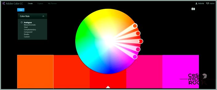
Let’s talk about how easy it is to navigate Adobe Color CC. If you’re already familiar with other Adobe products, you’ll feel right at home. The design is sleek and simple, with usability at the forefront. As soon as you land on the page, you’ll see the main attraction: a big color wheel, samples, sliders, and some color rules.
With Adobe Color CC, you have the power to manually drag the color wheel and create new color combinations. You can also check out other people’s color schemes, make your own scheme from an uploaded image, and so much more. It’s a powerful tool that every designer should get their hands on. And the best part? It won’t cost you a dime!
Creating Your Own Color Scheme
Now, you might be thinking, “Can someone like me, who doesn’t have an ounce of artistic talent, use this tool to create a color scheme?” Absolutely! Let me break it down for you.
First, you’ll want to select one of the white circles on the color wheel. Play around with dragging it until you find a tone you love. Depending on the Color Rule you have set, the other four colors will adjust to complement or contrast your choice. It’s super easy and quite fun, I promise!
Here’s the scoop on the Color Rules: Monochromatic creates four colors with a similar tone and depth as your chosen color. Triad splits the wheel into three, giving you five contrasting but harmonious colors. Complementary widens the color range, but still selects colors that work well together. And the Compound rules excel at finding complementary colors.
Need even more customization? No problem! There are sliders underneath the color swatches that allow for infinite tweaking. Click on a swatch to highlight it and adjust the RGB color bars or brightness with the white circles. Just remember, changes will only affect that one swatch, so be careful not to mess up your entire scheme in the process!
Discover and Get Inspired
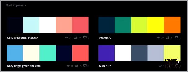
The Explore menu on the Color CC website is a treasure trove of inspiration. Whether you’re looking for ideas or searching for the perfect color scheme, this feature has got you covered. You can filter your search by Most Popular, All, Most Used, Random, and even by time settings.
When you click search, you’ll be presented with a page full of color schemes that will get those creative juices flowing. Trust me, there are hundreds to choose from, covering every color, mood, tone, and depth imaginable. And if you find a scheme that catches your eye, you can hover over it to get more information and see a larger version.
Now, on the right side of the page, you’ll find the Actions menu. From here, you can show your appreciation by giving it a thumbs up (Like), save it to your own library (if you register or log in with your Adobe ID), share it with others, or even edit your own copy of the scheme. That last one is perfect for all you artistic folks out there!

Creating a Color Scheme from an Image with Adobe Color CC
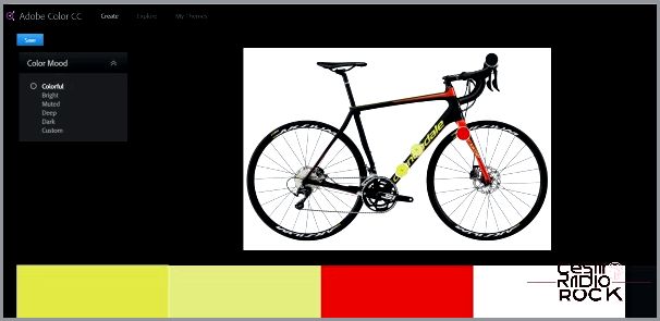
Let me tell you, I was curious to see just how easy it is to make a color scheme from an image. So, I decided to upload a picture of my bike because it has some vibrant colors. And boy, let me tell you, the site handled it like a champ! It managed to pick out the green color, the red, and the charcoal frame perfectly.
When I clicked on the Color Mood menu on the left side, I had the chance to explore various variations of the theme. I could choose from Bright, Muted, Deep, Dark, or even create a Custom setting. And let me tell you, Adobe Color CC nailed it with the colors for each setting. If someone like me can do it, I bet you can too!
Using Your Color Schemes in Your Designs
What’s great about Adobe Color CC is that it not only displays the RGB values of each color selection, but you can also use them however you like. If you’re using Illustrator, Photoshop, or any other Adobe product, you can directly utilize the scheme.
As long as you’re logged in with your Adobe ID while creating the scheme, you can easily use it within another Adobe product. For example, in Illustrator, you just need to select “Window” and then click on “Color Themes.” Your saved selections from Adobe Color CC should appear automatically in the themes window, ready for you to use. And if you want to save them in Illustrator, simply add them to your swatches and go from there.
Let me tell you, Adobe Color CC is truly a fantastic resource for designers of all kinds. I honestly haven’t come across any other app that even comes close to its user-friendly and powerful simplicity. And the best part? It’s completely free to use, even if you don’t own any other Adobe products. I mean, talk about a great resource!
